
Austin Prop. B Election Map
The 2021 local election in Austin has generated a lot of buzz largely due to Proposition B.
I saw this map on Twitter shortly after the election and was inspired to create my own version of the map using Python to automate data scraping, and GMT to script the mapping process.
 |
|---|
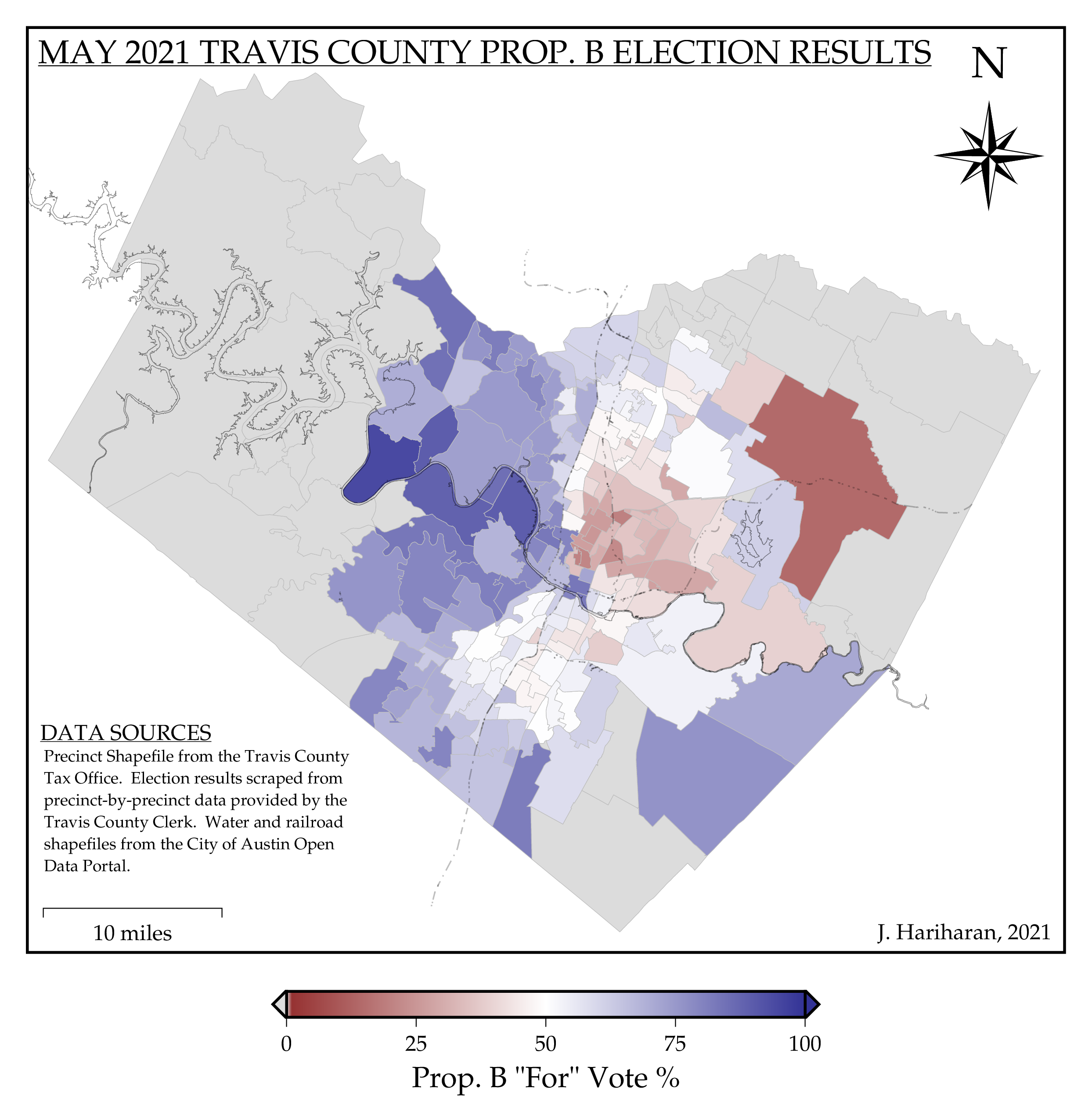
| Map of 2021 Prop. B Election Results per Precinct |
In this map the color of the precincts depicts the percentage of the vote “For” Prop. B in the 2021 election. The gray polygons are regions where the automated scraping was unable to associate any voting information to the precinct. From the north-west running to the south-east the Lower Colorado River is shown in light black. Even lighter still, the railroad lines are shown as faint dot-dash lines that can be seen running north-south through the city.
The data scraping process and map generation is all done programmatically via scripts, making this workflow flexible and extendable to different election results within the City of Austin. This workflow is open-source and available on GitHub with specifications about the software used and instructions for re-creating this map.