
Visualizing My Runs
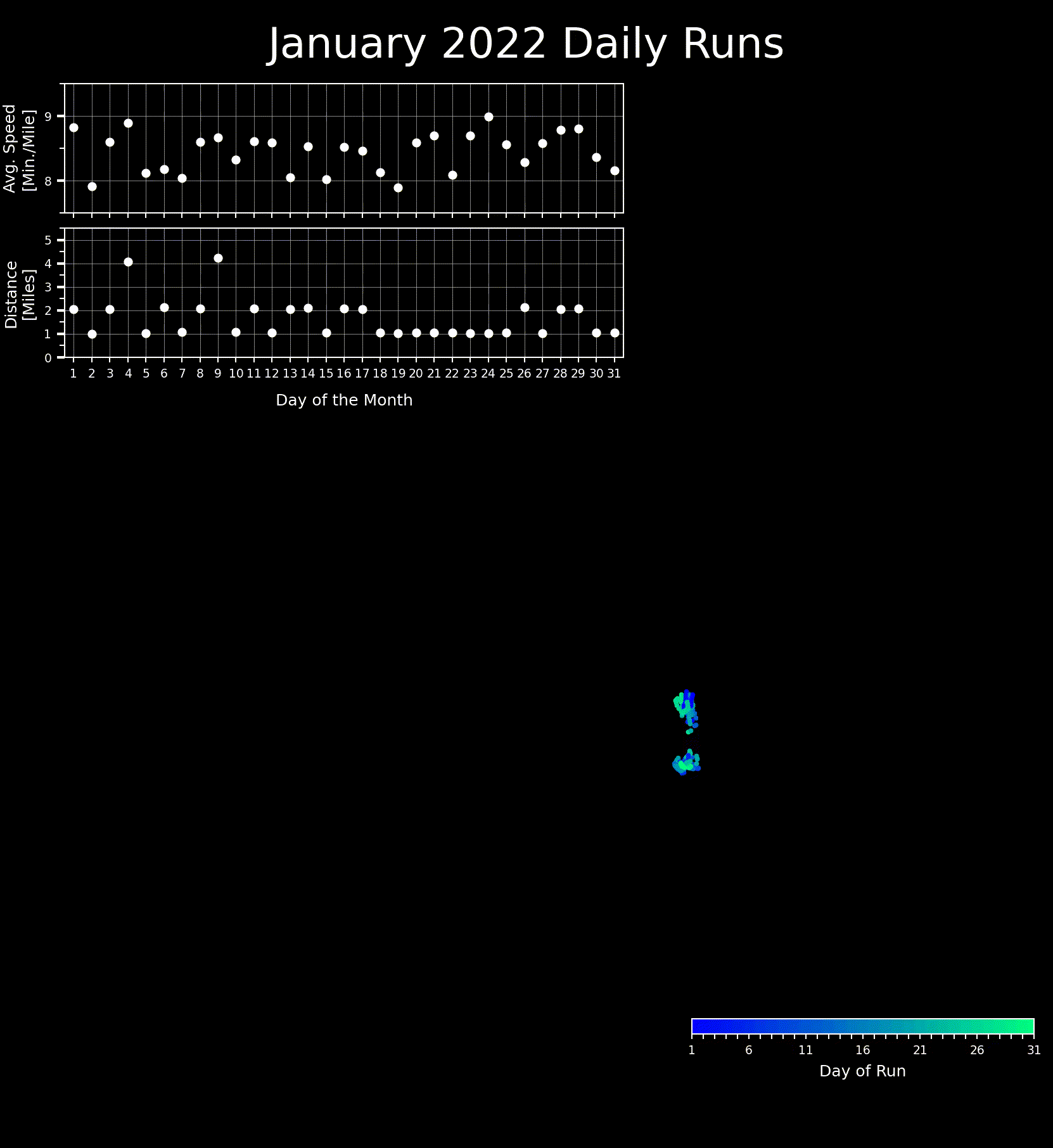
In January 2022 I went for a run every day and I tracked these runs using Strava. At the end of the month, I wanted a unique graphic displaying my efforts, so I decided to download my Strava data and figure out how parse, analyze, and visualize the runs I took in January.
Long story short, I was able to produce the animation shown below. Data parsing and visualization took place using Python, and relied heavily on the matplotlib, numpy, pandas, gpxpy, and cartopy libraries. At the end of the Python processing, the individual frames for the animation were turned into a gif using ffmpeg. The codes used to generate this visualization are available on GitHub in the StravaActivityVisualizer repository.
 |
|---|
| Animation of all 31 of my runs in January 2022 if they began simultaneously. |